LIGHTFORCE
Creating the new standard of orthodontics.
Brand Transformation:
Repositioning
Rebranding
Verbal Identity
Art Direction
Campaigns
Photography Courtesy of Lightforce


ENSURING THE COMPETITION DOESN’T BITE US IN THE A**
THE CHALLENGE
With competitors hot on their heels, LightForce faced a pressing challenge. Despite boasting a superior product, the brand's value propositions and points of differentiation were obscured by technical language, lackluster visuals, and a crucial flaw: it failed to resonate with consumers, doctors, and patients alike. Time was ticking, and LightForce needed to act swiftly to outshine the competition and claim its rightful place in the market.
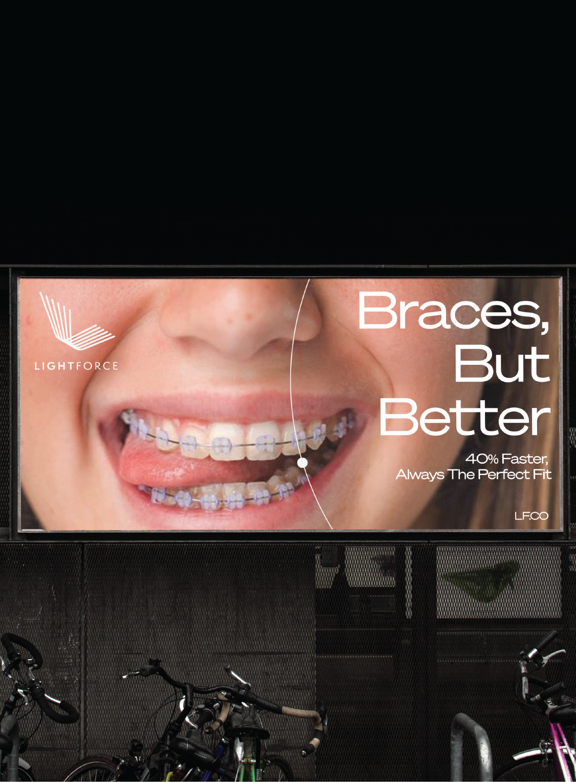
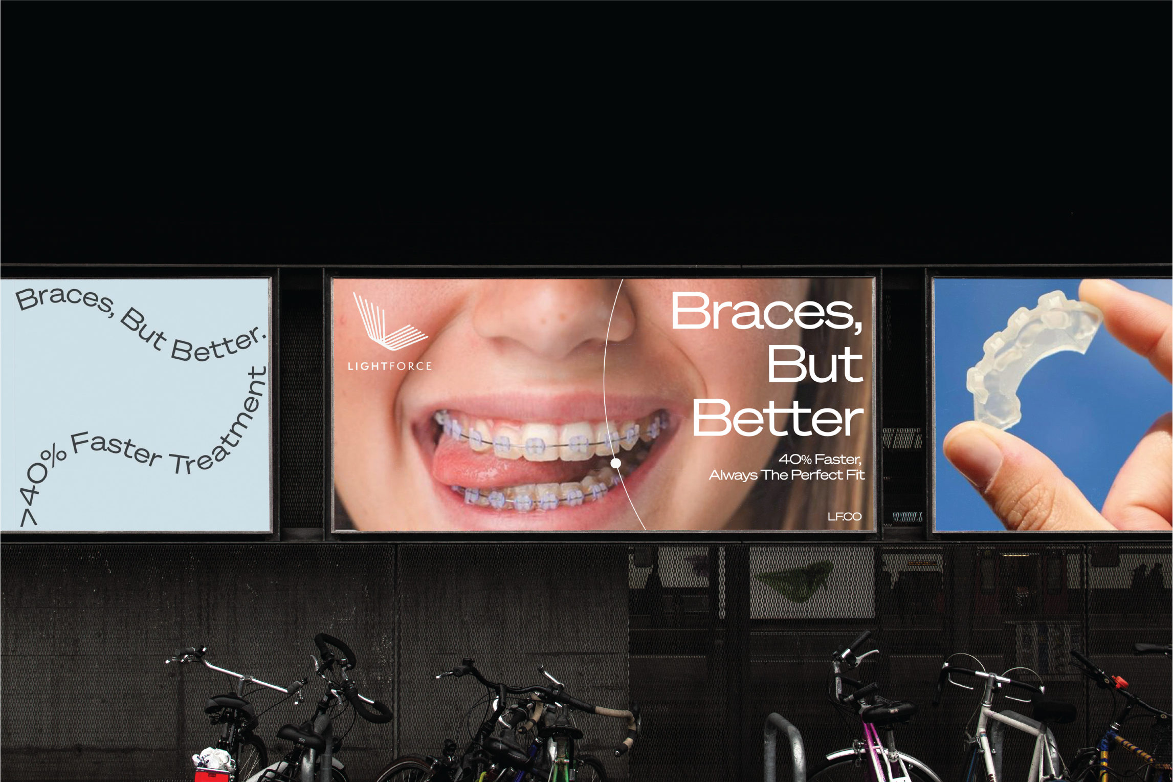
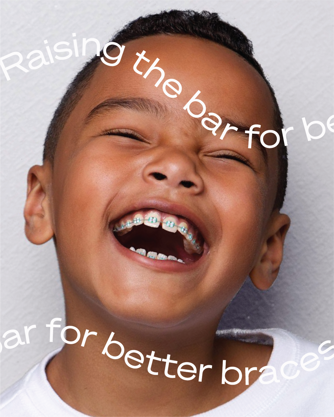
RAISING THE BAR FOR BETTER BRACES
CREATING THE ACTIVE POSITION
LightForce is more than just braces—it's about making people smile. As the new professional standard, LightForce utilizes technology to deliver confident smiles and ensure a superior experience for both patients and doctors. How do you draw a straight line to a powerful throughline? Braces, but Better.
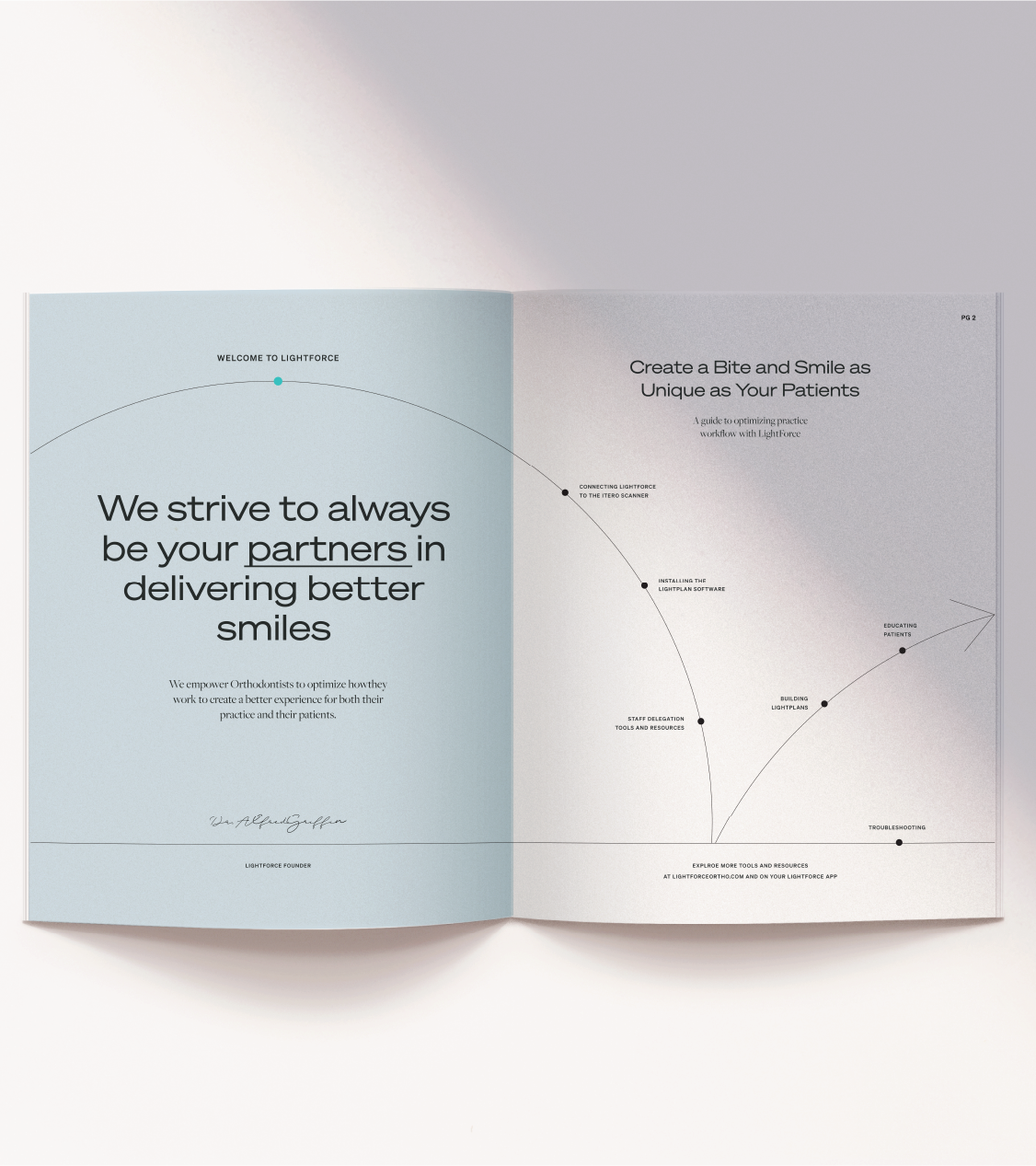
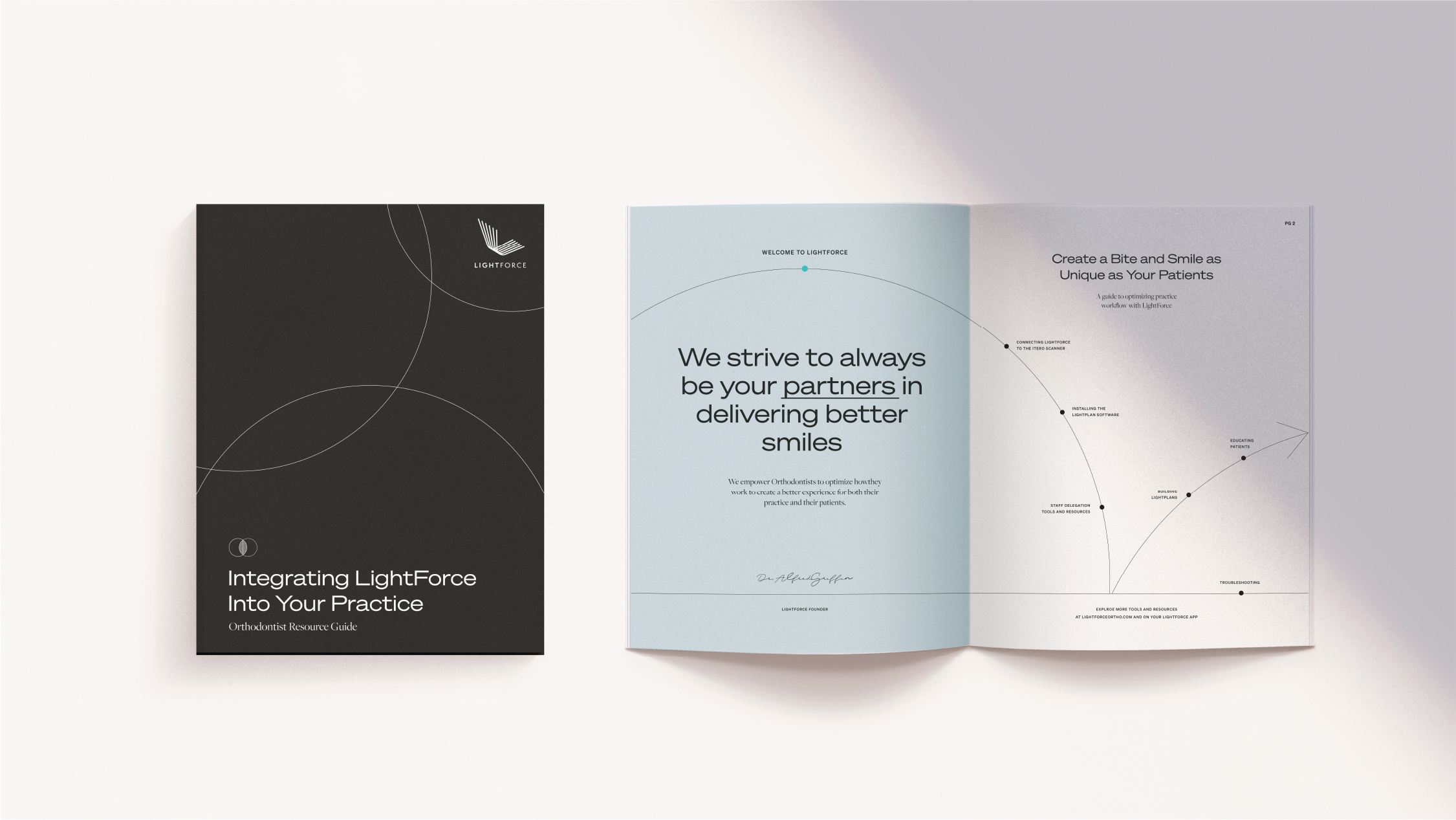
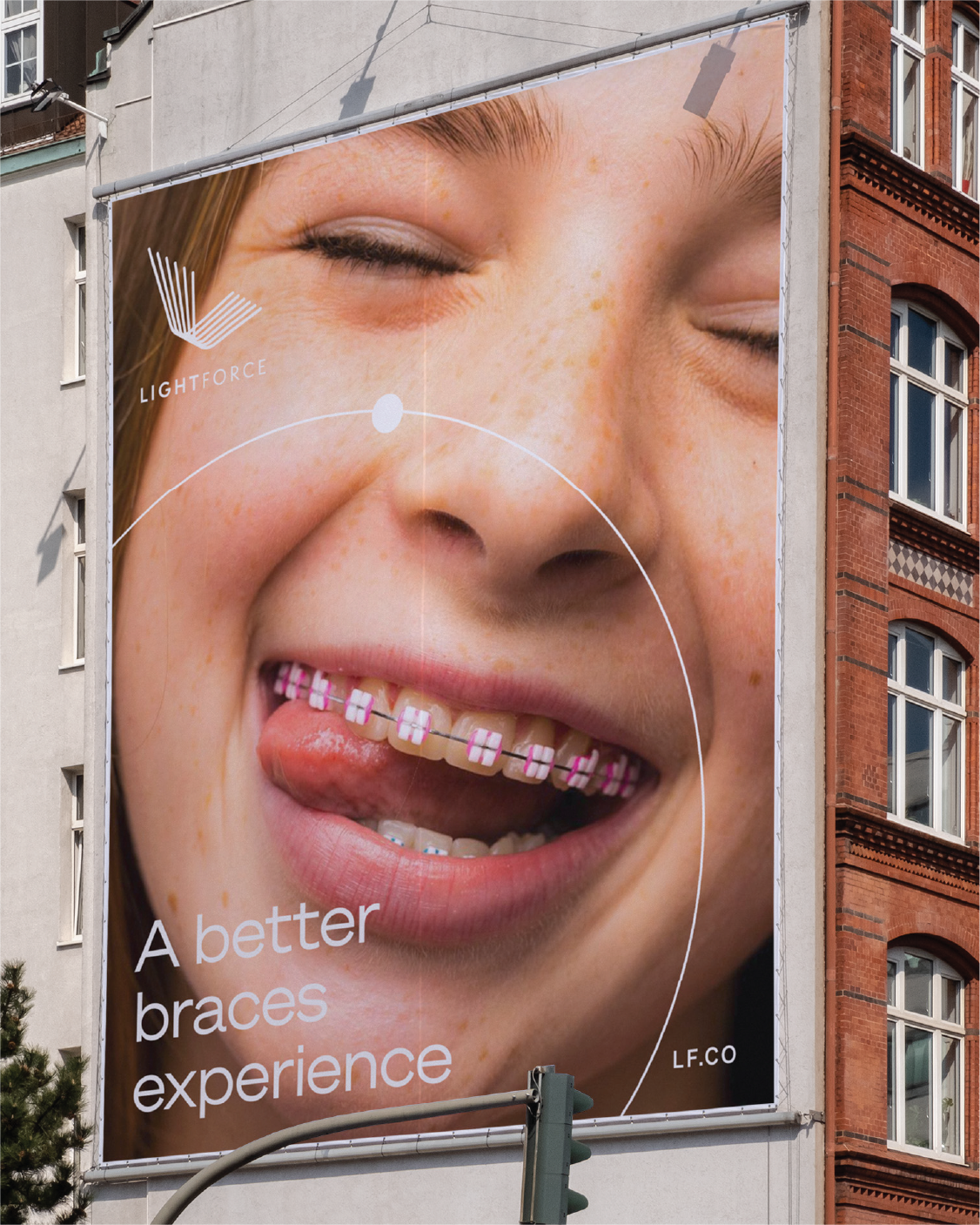
BRAND IDENTITY & CAMPAIGNS THAT DELIVER A SMILE
BRAND ACTION
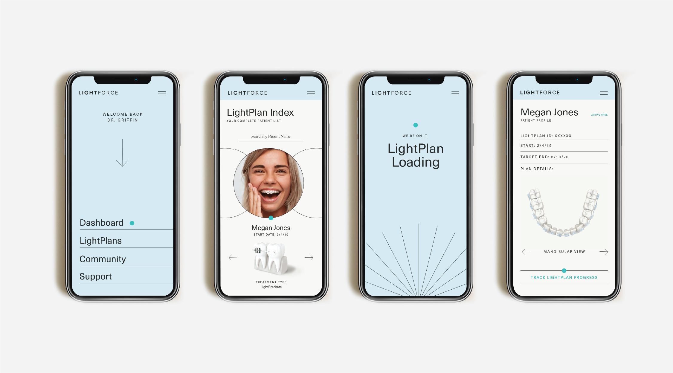
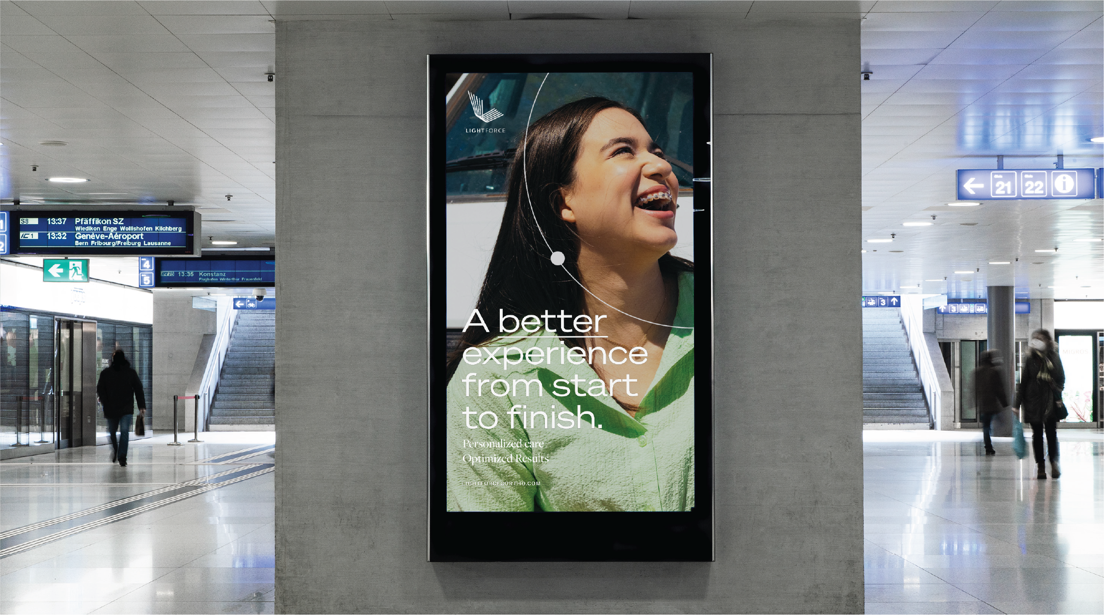
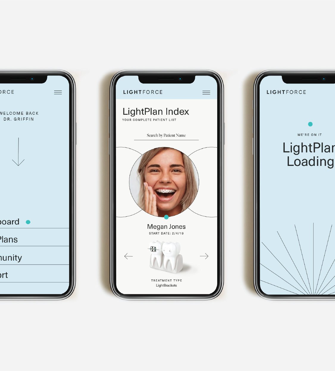
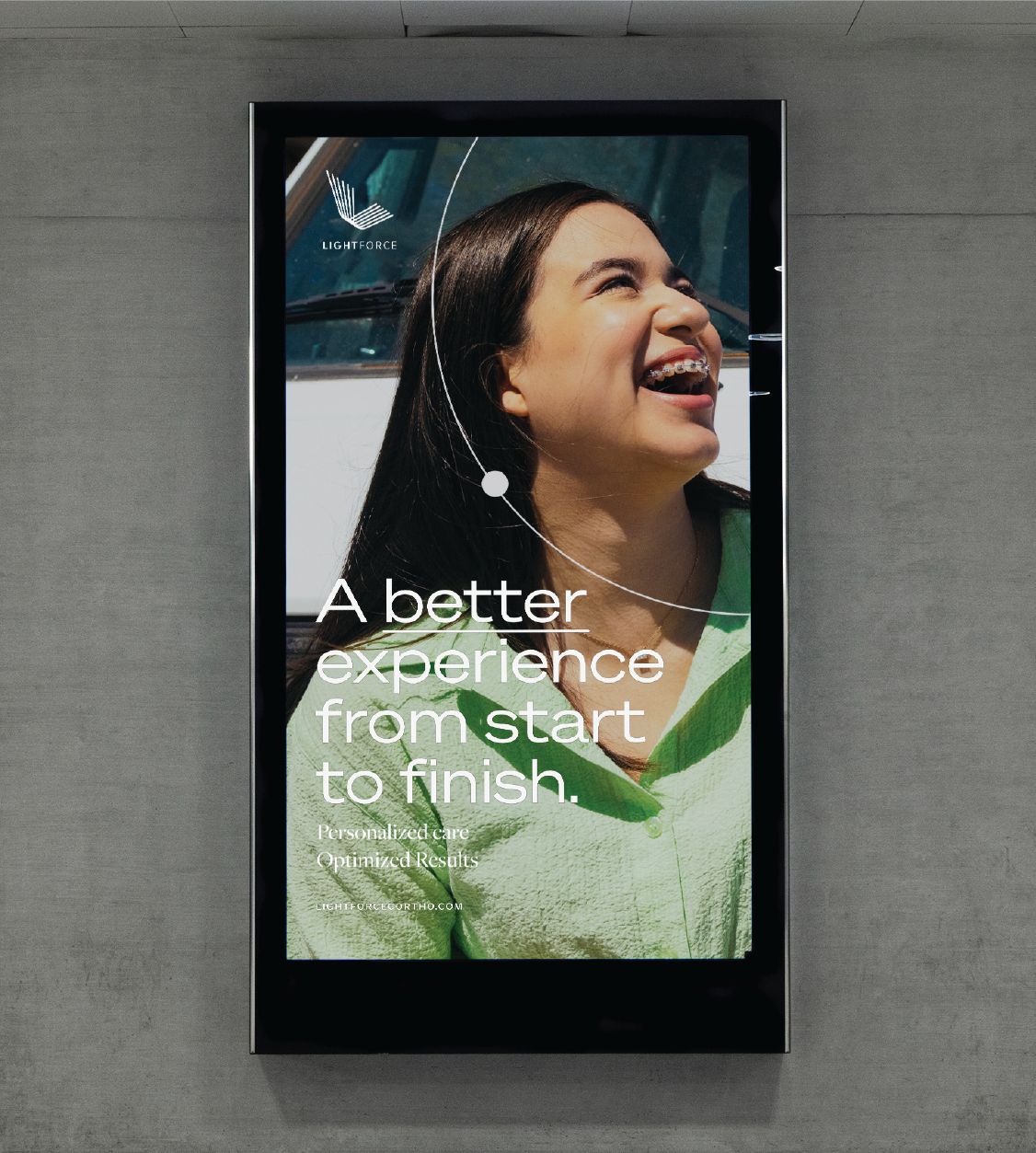
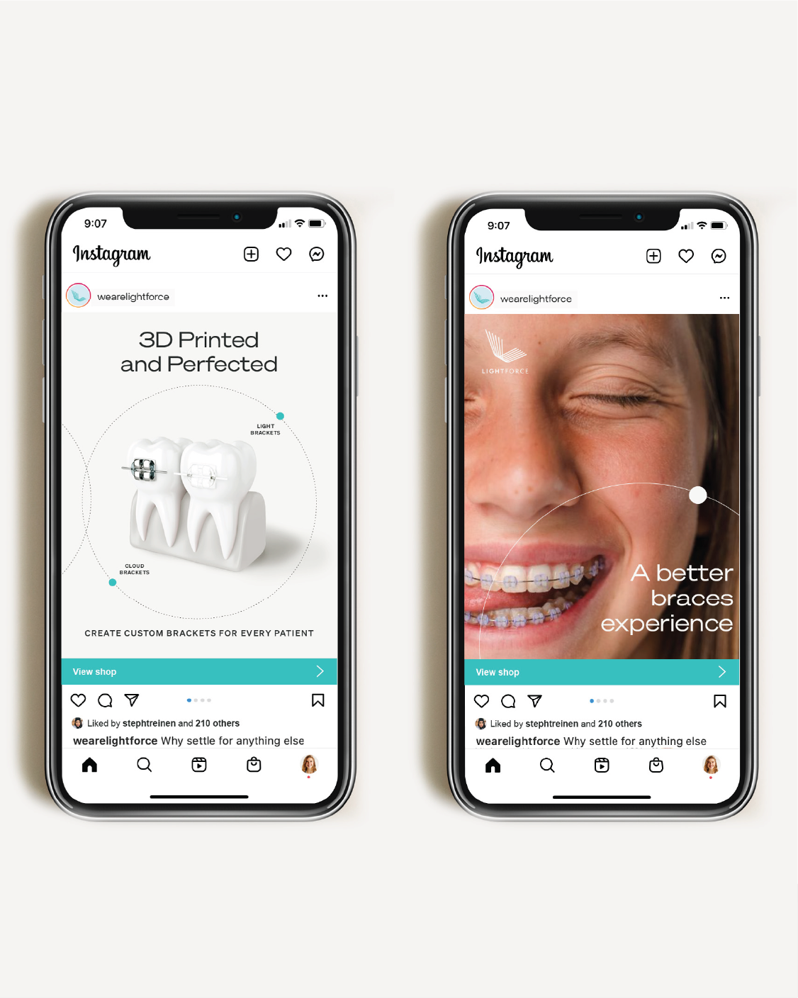
LightForce's initial request was to craft a captivating, smile-worthy brand identity. We struck a balance between its future household name status and its current B2B requirements, forging an identity that set LightForce apart from competitors and established it as a brand to watch.
DENTIST OUTREACH STRAIGHTENED OUT
BRAND GROWTH
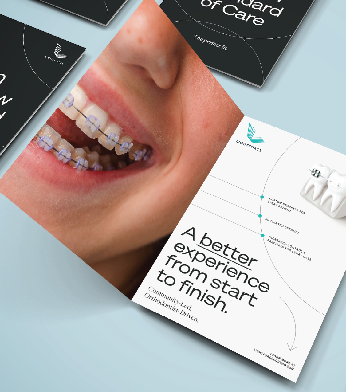
LightForce knew the key to brand adoption was dental practice staff. While the doctors made the ultimate call, a happy practice was a big conversion driver. These were the smiles we were after. Activation, sales tools, and materials that spoke to staff and their daily pain points—rooted in clear and distinctive value propositions—help to drive growth.
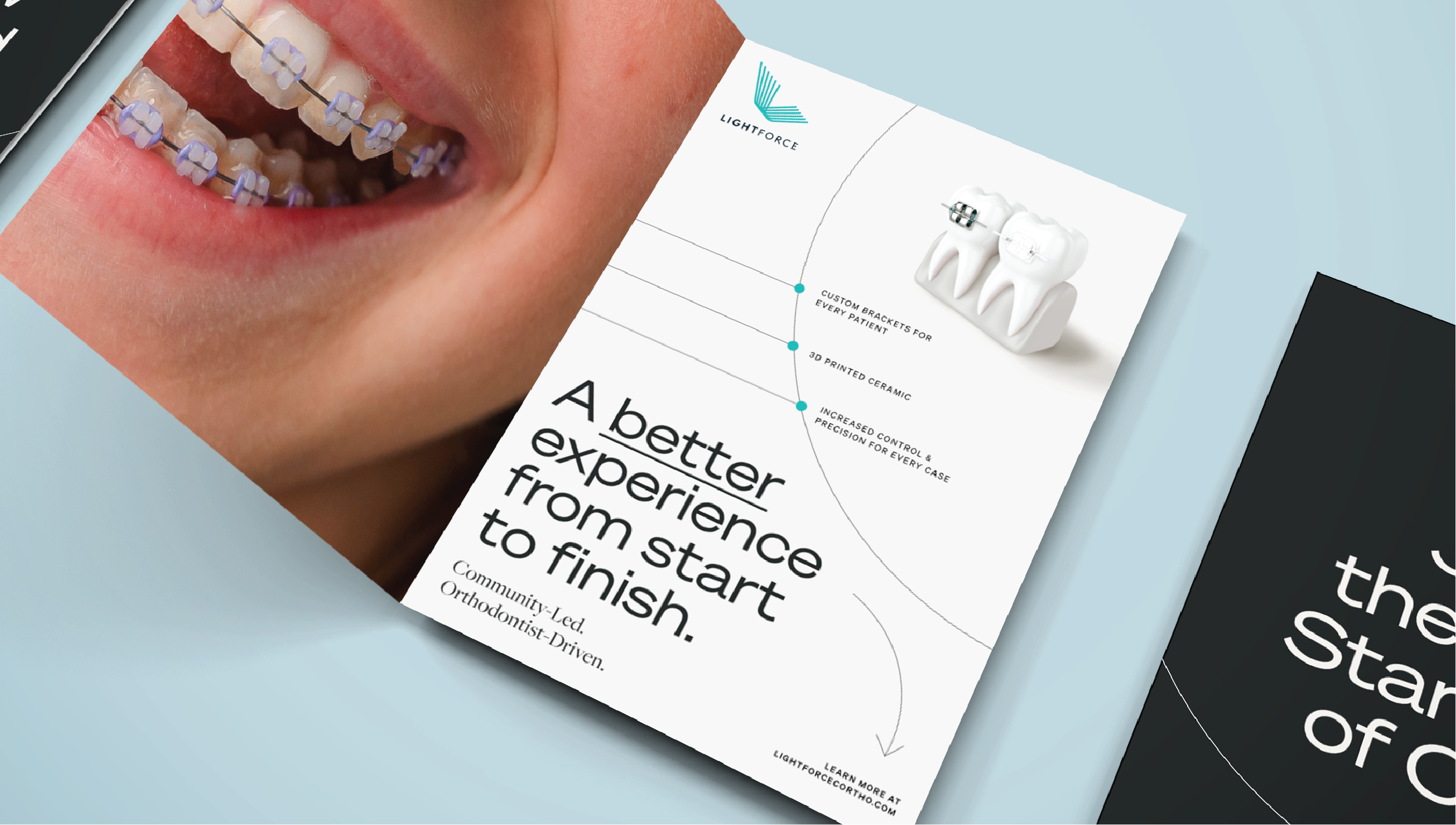
THE WAY YOU SPEAK DRAWS A SMILE
THE BRAND IGNITER
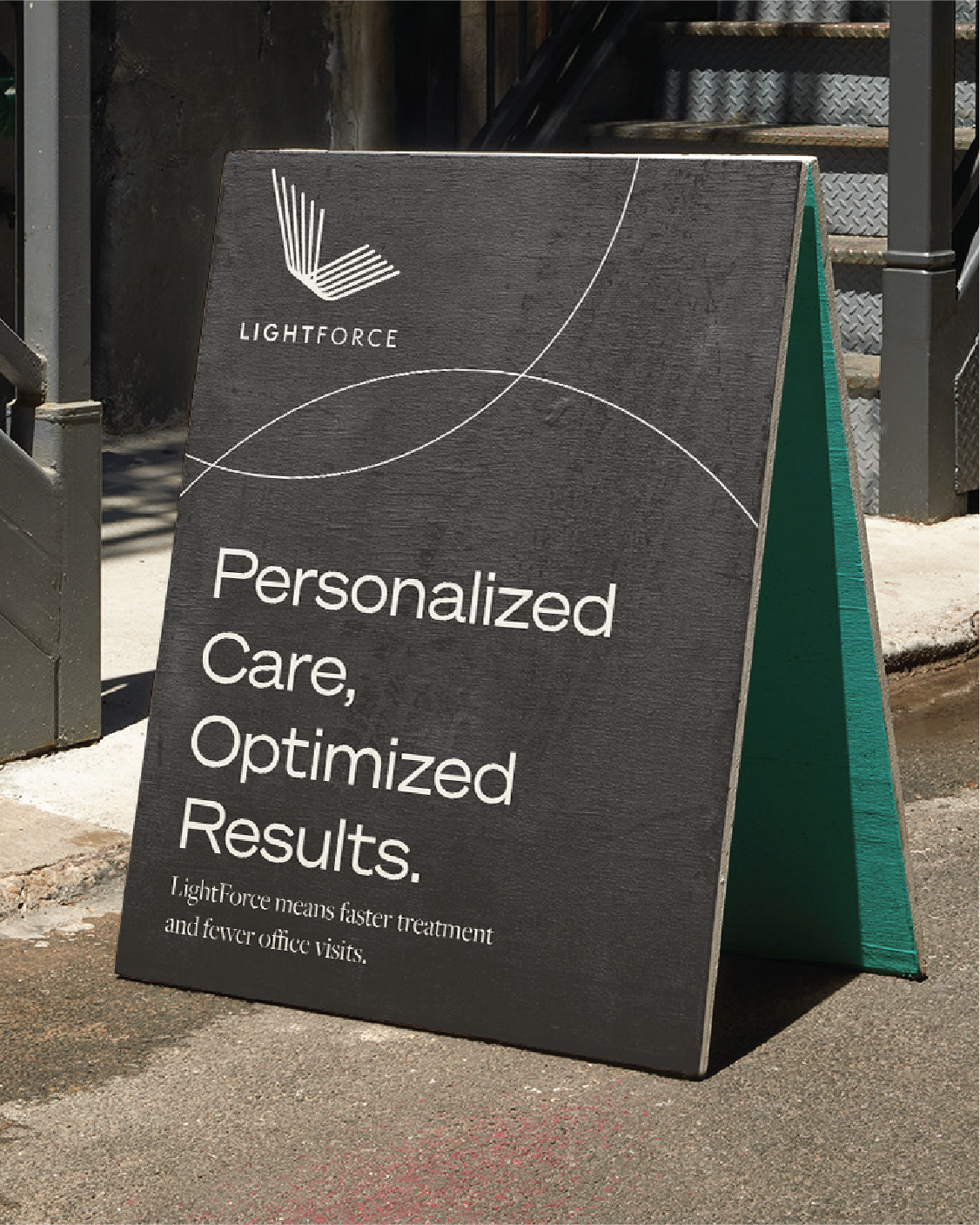
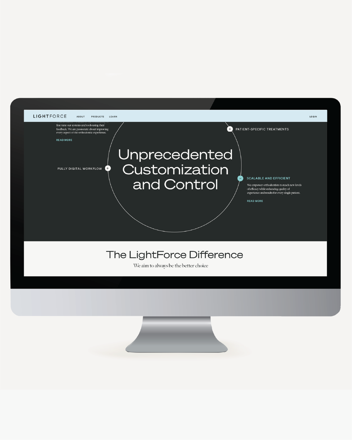
What makes people smile can be more than jokes. Clarity, confidence, and know-how for LightForces’ audience was grin-inducing. A strong B2B voice, with concise value propositions that presented strong points of differentiation: the key to happiness. LightForce represents quicker treatments, reduced office visits, personalized care, and optimized results. Our messaging targeted doctors and practices, addressing their bottom line, free time, and commitment to delivering more smiles than anyone in the industry.
“A fantastic partnership.”
—MATT, CMO, LIGHTFORCE
More Projects

ZAPPOSCAMPAIGN

Mia BecarBRAND POSITIONING, BRAND IDENTITY, CAMPAIGNS, PACKAGING

AmassBRAND POSITIONING, STRATEGY, VISUAL IDENTITY, PACKAGING

OFIOFOBRAND POSITIONING, STRATEGY, VISUAL & VERBAL IDENTITY
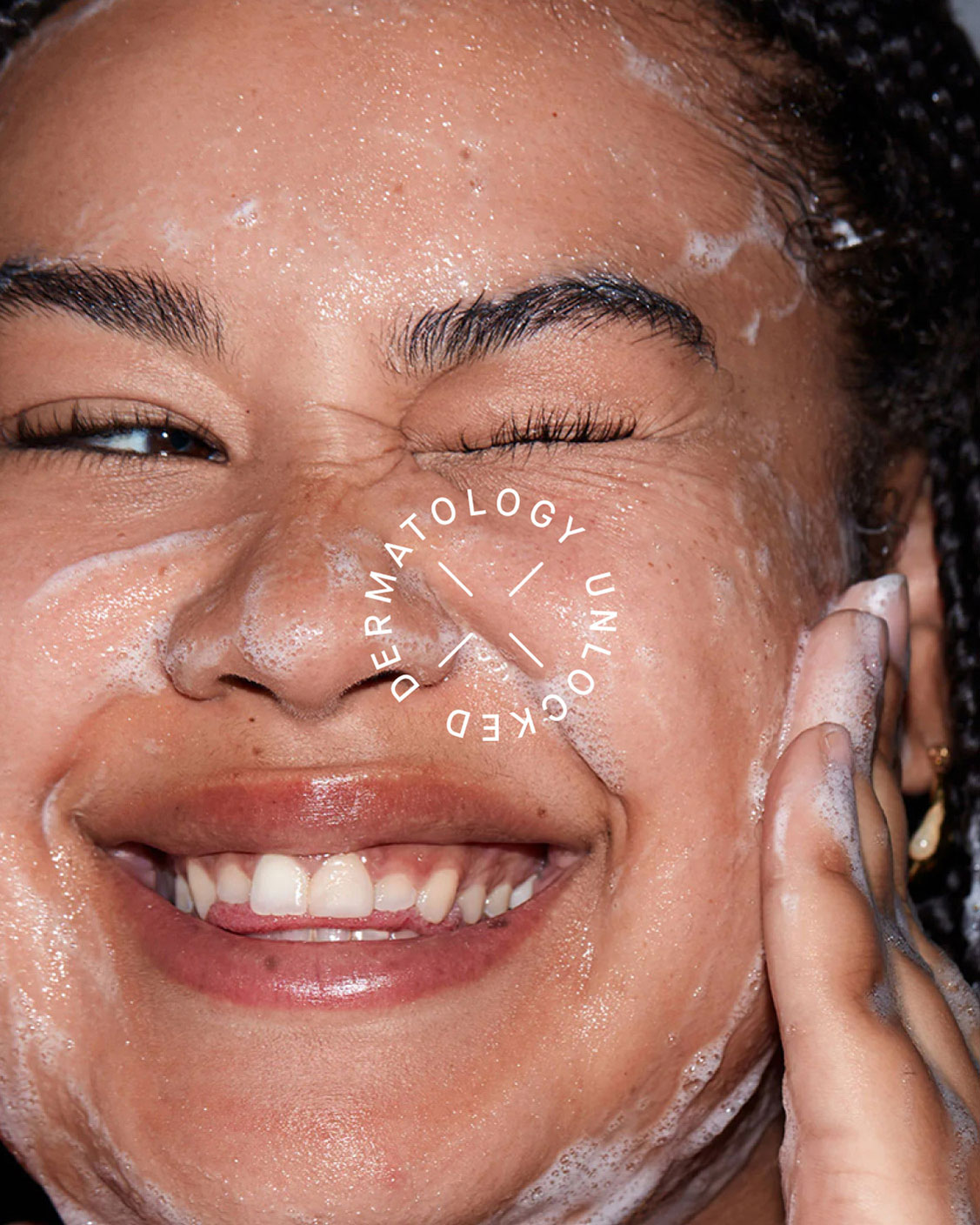
SLMDBRAND POSITIONING, REBRANDING, VISUAL & VERBAL IDENTITY, PACKAGING
ELYSIABRAND POSITIONING, STRATEGY, VISUAL & VERBAL IDENTITY

CASA OKBRAND POSITIONING, STRATEGY, VISUAL & VERBAL IDENTITY
ONE MAIN FINANCIALBRAND STRATEGY, CONSUMER EXPERIENCE, RETAIL EXPERIENCE

TorchesBRAND POSITIONING, STRATEGY, VISUAL & VERBAL IDENTITY
PinterestCAMPAIGN

BEEFSTEAKBRAND STRATEGY, MARKETING

CHICAGO PUBLIC DEPT OF HEALTHCAMPAIGN STRATEGY & CONCEPT, VISUAL IDENTITY, MESSAGING

Sex WIth EmilyBRAND POSITIONING, VISUAL & VERBAL IDENTITY, WEB DIRECTION

EVERYTABLECAMPAIGN

710 LabsBRAND POSITIONING, REBRANDING, VERBAL IDENTITY, PACKAGING
Milan()
Los Angeles()
GET GOOD THINKING WEEKLY: